25 Best Examples Of Effective FAQ Pages

Frequently Asked Question (FAQ) pages (or informational hubs) enable your business to respond, react, and anticipate the needs of your audience more quickly and appropriately than other types of destination page experiences.
An effective FAQ resource can educate, inform, and naturally guide the user through your website’s content and toward the goals and results you have set.
Over the years, the role of the FAQ page has changed substantially, and now an FAQ page is an essential webpage to have on your site.
What’s The Purpose Of An FAQ page?
Firstly, FAQ pages can bring new visitors to your website via organic search and drive them quickly to related pages – most typically deeper blog pages and service pages closely related to the questions being resolved.
Next, one of the most significant opportunities for impactful brand visibility within the search engine result pages (SERPs) is targeting audience questions, wants, needs, and pain points.
The FAQ page is one of the best ways to help people visit your site and get snippets of answers in front of users before they click any results within the search pages.
A helpful FAQ page (more likely an FAQ hub of core pages and topical intent) shortens the time it takes for people to solve their search requirements.
The experience from the first visit to conversion is also faster because you remove any possible barriers to knowledge (informational and often trust).
As a company, you are showcasing expertise through FAQs, plus introducing your key staff, knowledge, and unique insights into the industry sooner.
Additionally, you add credibility and value through meaningful content in the many forms your audience requires.
This will typically include audio, visual/video, and layering of content types now, compared to traditional text-only content provision.
You are also servicing the need for offline conversation and experience through faster and always available online mechanisms.
People will always seek help and advice. They are unwilling to pick up the phone, walk into a store, or wait hours (even minutes) for that information or insight to become accessible.
It needs to be available now and be in the format they enjoy the most.
Why FAQ Pages Are A Priority
FAQ pages continue to be a priority area for SEO and digital marketing professionals.
An FAQ page is one of the simplest ways to improve your site and help site visitors and users.
Your FAQ section should be seen as a constantly expanding source of value provided to your audience.
It is a place where their ever-changing and growing requirements are not only met but anticipated and exceeded frequently.
In no small part, the importance of FAQ pages has been driven in recent years by the growth in voice search, mobile search, and personal/home assistants and speakers.
These predominantly rely on the pre-results (Google Answers and Featured Snippets) and can be explicitly targeted with FAQ pages.
People need conversation, comparison, and support for most of their decision-making online and offline; FAQs can cater to them all.
An effective FAQ page seeks to:
- Reflect and respond to your audience’s needs wholly and thoroughly.
- Cover a broad range of intent (transactional, informational, locational, etc.).
- Stay updated based on new insights from your data, the industry, and broader best practices.
- Land new users to the website by solving problems and supporting return visits with regular additions and valuable expertise sharing.
- Drive internal pageviews to other important pages and support key conversion paths.
- Fuel blog (and deeper content) creation logically and intuitively ties together semantically relevant content.
- Shine a light on expertise, trust, and authority within your niche, giving your brand and key staff a platform to educate, inform, and support your community.
25 Of The Best Examples Of FAQ Pages
Now, let’s look at 25 great examples of FAQ pages/resources and why they’re so effective.
1. Caesarstone
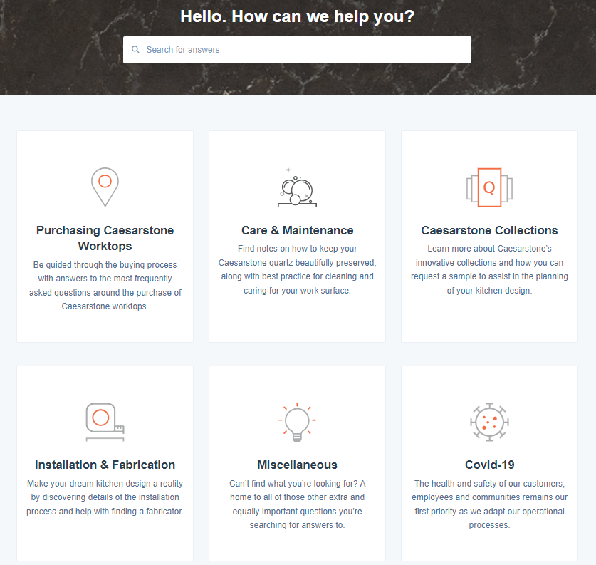
The FAQ resource for Caesarstone UK provides a simple, intuitive user experience where common queries are grouped together into tailored landing destinations.
As seen in this example, FAQs should be easy to navigate, fast to access data, and enable single-click answers.
 Screenshot from Caesarstone, September 2024
2. Siren Craft Brew
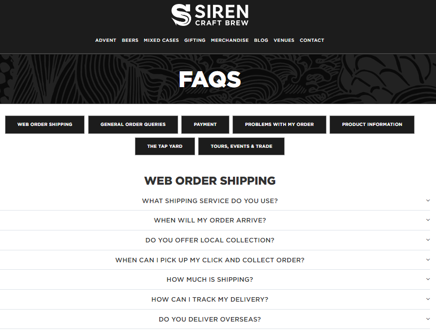
Using secondary navigation elements, plus expandable div content, Siren Craft Brew simplifies topical content discovery for easy access to information regardless of device.
 Screenshot from Siren Craft Brew, September 2024
3. Amazon
It should not be surprising that Amazon is included in the 25 best examples of FAQ pages.
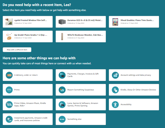
The company’s use of data to provide a tailored experience, and application of AI to enable ongoing conversation, means you receive an almost human sharing of insight and support, plus a practical understanding of your needs.
 Screenshot from Amazon, September 2024
4. WhatsApp
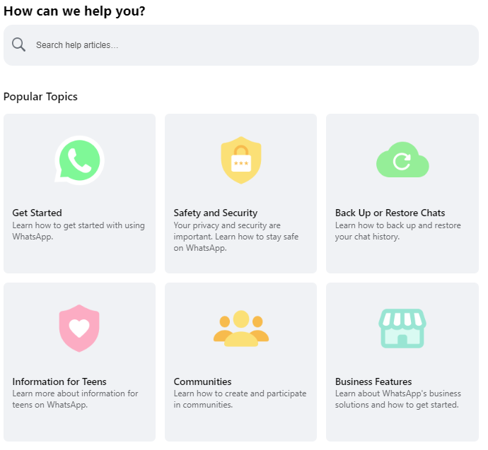
The Whatsapp Help Center is bright, easy to use, and categorized effectively for quick desktop or mobile use.
When considering the functional role and practical requirements of an FAQ resource, it can be easy to forget the importance of loading time and speed of access to information.
Added to this, the conversational tone helps cement the resource as a place to help, provide solutions, and impart advice.
 Screenshot from Whatsapp, September 2024
5. Wikipedia (Wiki Help)
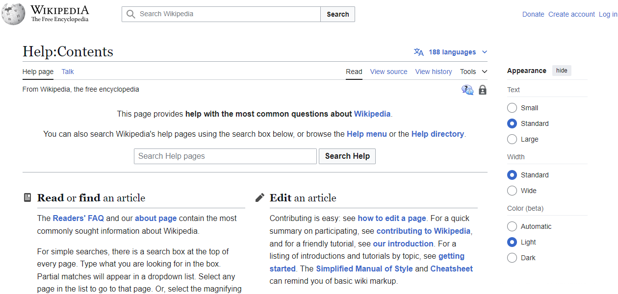
Wikipedia’s help center is an excellent example of a traditional text-orientated FAQ page.
It is text-heavy, blocked into key topic areas, and has extensive access to all the critical support areas you could ever need.
There is something necessary, meaningful, and nostalgic about FAQ-orientated websites like this, plus they are hugely helpful and remain more than fit for purpose.
I also like the easy way you can change the look of the FAQ resource from the right-hand appearance functions to make it more accessible to your preferences.
 Screenshot from Wikipedia, September 2024
6. P&O Cruises
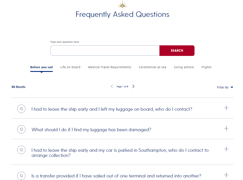
Providing a refreshing balance between lifestyle choices and more targeted cruise booking and experience-based FAQs, P&O Cruises offers simple, effective solutions to the people using this information hub.
 Screenshot from P&O Cruises, Sept 2024
7. Lucy And Yak
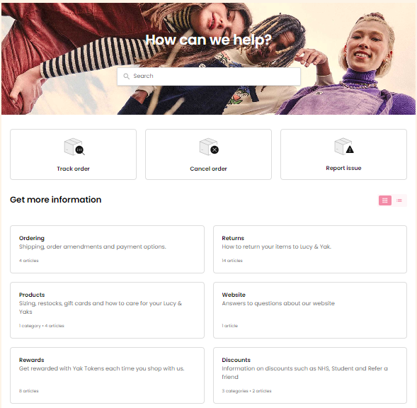
Ecommerce sites often overlook the human element of FAQ resources, and they become very functional.
Lucy and Yak presents the complete opposite – an audience-aware, user-friendly, and easy-to-engage-with FAQ hub.
 Screenshot from Lucy and Yak, Sept 2024
8. Asda
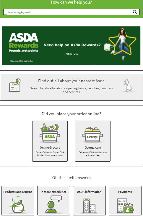
The Asda customer help center feels friendly in tone, design, and imagery. For a large brand to impart this type of sentiment is a positive step forward.
The play on words like “off the shelf answers” provides a playful way to entice people to engage which is what an FAQ resource is all about.
 Screenshot from Asda, September 2024
9. Truhouse
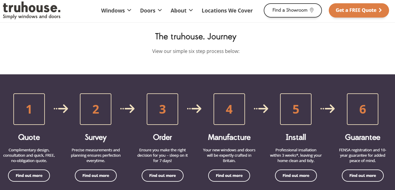
The standout feature of the Truhouse client help/FAQ resource is that it is split into every step on the user information-seeking and buying journey.
I haven’t seen many other examples where the FAQs are so clearly demarcated and simplified for people to access and keep progressing through their journey.
 Screenshot from Truhouse, September 2024
10. Nike
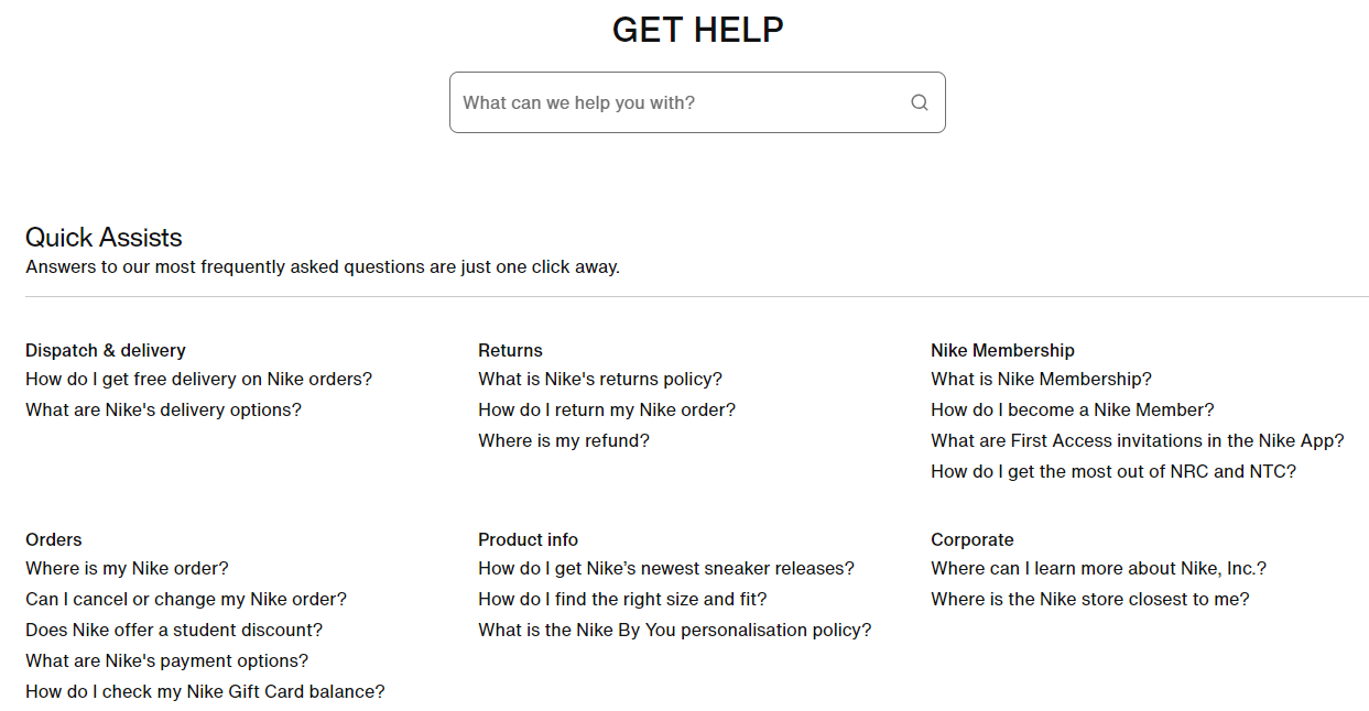
The customer help “Get Help” section from Nike is a great example of active white space and a call to action in design.
The FAQ page can often be overly complex and challenging to use.
From wording to design, the Nike example shows that less can be more with FAQ pages.
 Screenshot from Nike, September 2024
11. World Animal Protection
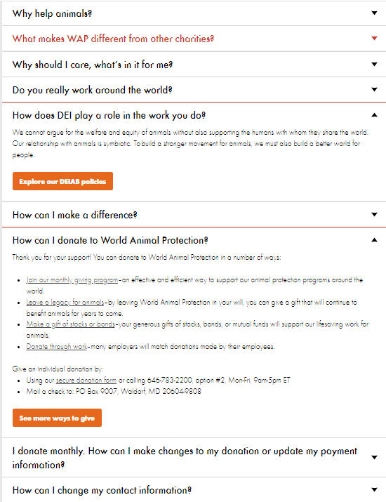
FAQ pages should pull together lots of dispersed content in a simple, logical, and usable manner.
World Animal Protection does exactly that.
As a user, your time is valuable. You want to move through your website journey as quickly as possible – this type of information handling and presentation offers functionality through design.
 Screenshot from World Animal Protection, September 2024
12. LinkedIn
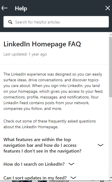
LinkedIn help FAQ provision is the least disruptive to the user.
You can maintain your current focus on the platform, and open an interactive FAQ feature to support your intent, then continue your activity with limited distraction.
Surprisingly, more websites don’t adopt this type of on-the-go FAQ approach.
You can access this feature from your profile icon drop-down list.
 Screenshot from LinkedIn, September 2024
13. Microsoft
FAQs are the perfect platform for mixed content types to distill complex information into bite-sized chunks.
The video provision and community integration in Microsoft support stand out from the competition in terms of content delivery and direct application of FAQ support.
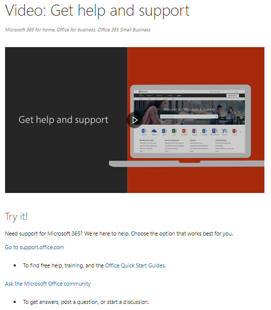 Screenshot from Microsoft, September 2024
14. UCFB
When making important lifestyle decisions such as education, FAQs can be a fantastic way to immerse yourself in the key details.
The UCFB helpful information resource delivers a wealth of information within a clean and simple design format.
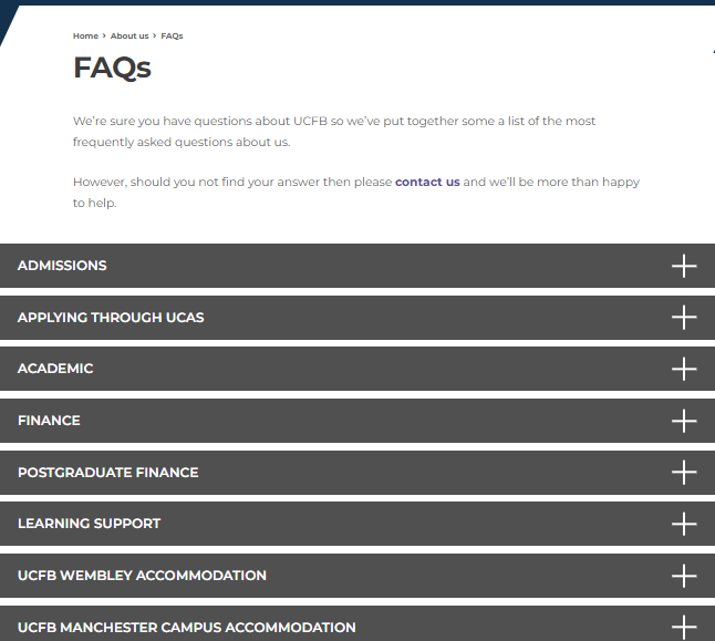 Screenshot from UCFB, September 2024
15. Google
Google Support goes beyond the mainstream expectations of FAQs.
From design, layout, information provision, and more, this FAQ resource is a useful point of reference for pulling together vast quantities of information effectively.
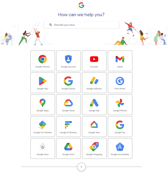 Screenshot from Google Support, September 2024
16. Hillier
When you are trying to replicate a predominantly offline experience like gardening online, it can be difficult to enable people to buy online.
The Hillier FAQ section, however, reinforces that experience through effective expertise sharing and positive reinforcement of the brand.
It almost feels like you are in a garden center, which you’d expect resonates well with their audience.
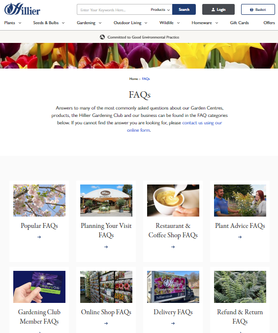 Screenshot from Hillier, September 2024
17. Tilda Rice
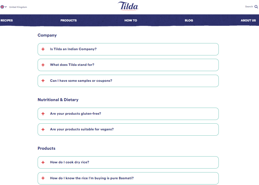
FAQs can work most effectively when part of a wider body of useful community content.
This is where Tilda Rice’s FAQs come into play.
 Screenshot from Tilda Rice, September 2024
18. Trent Furniture
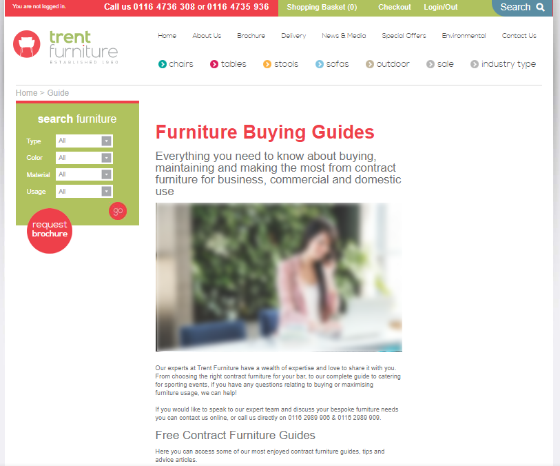
The Trent Furniture FAQ section acts as both an FAQ resource and a guide roll-up resource.
This means that users can access top-level information, deeper, more comprehensive buying guides, measurement information, and a whole host of other insights normally only accessible through blogs.
For ecommerce sites, it’s positive to access layers of content depth relevant to your buying decisions – whether you intend to purchase in the same session or are working your way through the buying and information-seeking journey.
 Screenshot from Trent Furniture, September 2024
19. Spotify Community
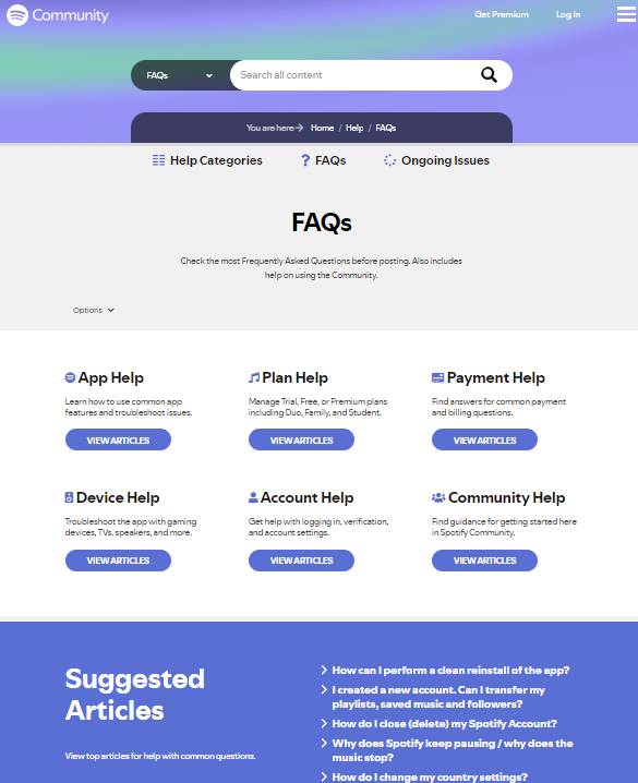
Community sites are, by design, there to facilitate effective knowledge sharing, communication, and access to information.
The Spotify Community FAQs resource enables push and pull information access. As you’d expect, core recurring user needs are segmented for fast FAQ provision, plus core articles are sign-posted.
 Screenshot from Spotify Community, September 2024
20. Etsy
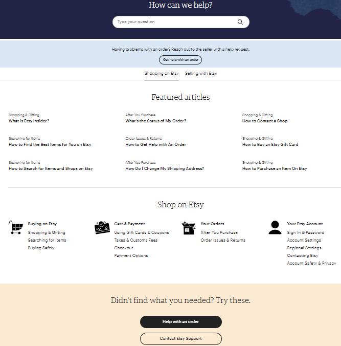
It’s interesting to see how ecommerce sites have increasingly prioritized FAQ hubs over the years.
Etsy is a good example of this in action, sharing layers of information and adding a spotlight on cornerstone content that is most frequently engaged with by its user base.
 Screenshot from Etsy, September 2024
21. Carbase
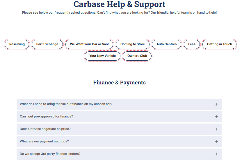
FAQs should be purposeful and provide clearly defined problem-solving contributions that are easily accessible.
Carbase FAQ page is a good example of this. There is clarity on the main information topics, supported by prioritized expertise topic areas that enable people to further their journey with minimum clicks.
 Screenshot from Carbase, September 2024
22. Wateraid
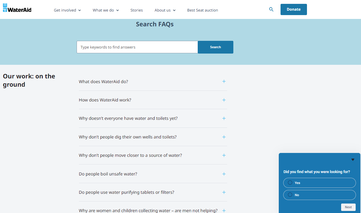
When you are telling a compelling story and look to encourage people to take action at every interaction, the FAQ hub plays a vital role.
In the Wateraid FAQ example, you can see the catch-all concept in action, looking to maintain interaction, and empower people to support and donate.
The combination of AI with chatbot functionality, and traditional topic-based text information provision works seamlessly.
 Screenshot from Wateraid, Sept 2024
23. Airtable
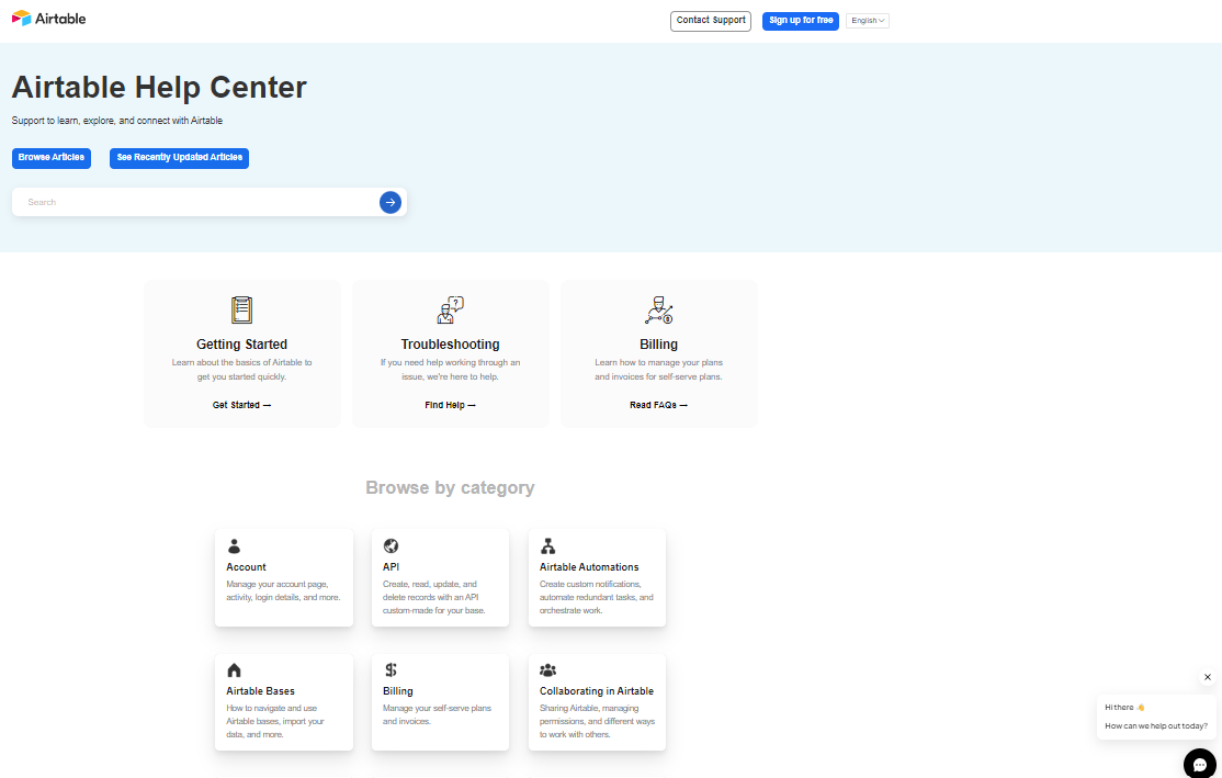
Airtable’s Help Center has changed quite a bit since previously reviewing it a number of months ago. However, it still warrants inclusion in this list of top FAQ resources.
The content segmentation, chatbot support, and clear/simple interface is ideal for FAQ content types.
 Screenshot from Airtable, September 2024
24. Reddit
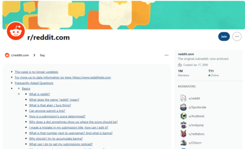
There is a nostalgia for the Reddit FAQs section.
It works and is functional, but somehow takes you back to the early 2000s.
The no-nonsense access to text links of information is a nice reminder that there are many ways to achieve the same goal.
 Screenshot from Reddit, September 2024
25. Stephen King
As a lifelong fan of Stephen King, I may be biased, but I love the fact that the FAQs hub on the Stephen King website gives the feeling of a literary experience.
The table of contents and background set a scene of reading a book and being part of the story.
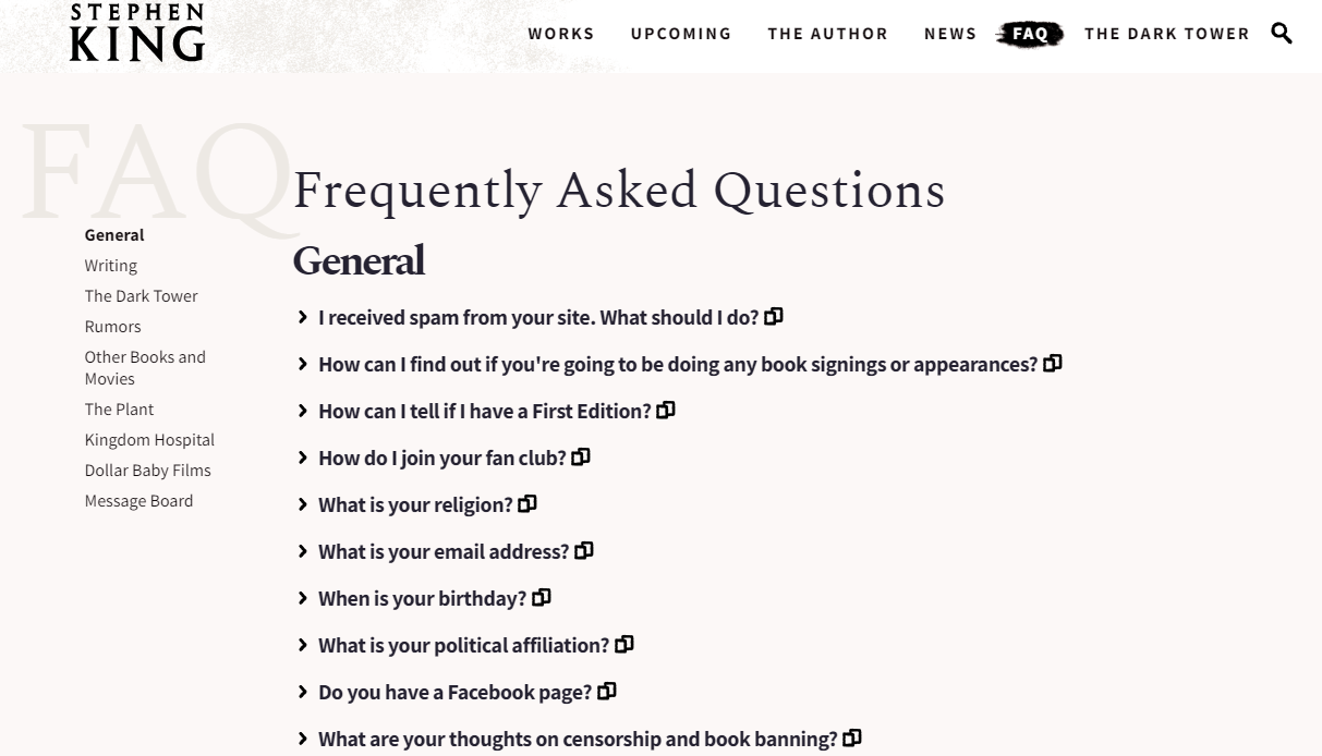 Screenshot from Stephen King, September 2024
Creating An Effective FAQ page
Whether you have an FAQ page in place, believe it can contribute more, or are looking to create a new FAQ resource for your website, it’s essential to consider the next steps.
Remember not to overlook the necessity of gathering data in your FAQ section. Use this to continue adding to it, refine, and expand the ongoing value provision to your audience.
Your FAQ resource needs to be proactively updated to cater to all the new and ever-changing data sets reflecting your existing and new community requirements – offline and online.
1. Decide On The Purpose Of The FAQ Page
Suppose you wish to bring your experts to the foreground and provide ongoing audience support. In that case, your FAQ hub will function very differently than it would if you intend to increase the ease of access to know cornerstone content on your website.
You need to have a clearly defined FAQ section purpose and ensure you support this with business objectives and KPIs.
This helps maintain prioritization and justification to keep investing resources and focus on FAQ development alongside more traditional commercial website pages.
2. Plan In Advance To Maintain And Grow Your FAQ Hub
Your audience questions will change frequently, and you must ensure that your FAQ content reflects this.
Data within Google Search Console (GSC), on-site search behavior, plus broader industry trends will help inform this.
Don’t limit your data gathering to a single source, however.
Look at the competition, consider Google Rich Results (using tools such as Semrush), and look at the completeness of your expertise provision through your FAQ content.
3. Look Outside Of Your Company Data Environment
While your data is fantastic for servicing your existing customer base, there are often multiple layers of FAQs to fulfill.
You can use free tools such as Answer the Public for more general questions, Google Trends, and competitor sites.
The opportunity to answer In-SERP questions grows all the time. You want to be present in these conversations by showcasing your FAQ content and creating compelling content types to target these items correctly.
4. Structuring FAQs
Both your page and individual FAQs (whether a single FAQ page or entire sections of your site specific to FAQ content) need some consideration on how you structure them and make a lot of varied content accessible for the user and search engines alike.
Consider the expandable on-click text at the individual FAQ level to keep answers clean and easy to use.
At the page structure level, take time to prioritize content based on value and demand, plus technical optimization areas such as the use of schema, page speed, and mobile-friendliness.
Remember that people look to digest content in many ways.
FAQ content does not have to be text only. It’s far broader reaching and valuable to people and for search if it’s multi-tiered and varied in content types.
5. Use Data To Refine & Improve: Part Of “Always On” Focus
FAQ pages quickly become outdated, and their value declines over time.
Make sure you are testing page changes and iteratively improving everything from headings and clickable page elements to new data-led content additions and calls to action.
Every month, there will be evidence-led chances to improve, and this mentality is key to maximizing business and user impact.
6. Don’t Forget The People Element
The most successful FAQ pages and help center hubs often stem from a deeper understanding of the people they are intended to help.
Data and evidence are always important, but you must balance this with real-world insights and offline experiences.
The best people to help with this are the front-line staff, who actively engage with your audience daily and truly understand how online and offline FAQs can support and enrich your problem-solving offering.
Your FAQ section supports your staff as much as it’s present to help educate and inform your community.
Think about your recurring conversations and how they can be served equally well online.
Don’t forget mixed content types to replicate the offline experience online, plus the need to gather feedback from your users directly.
As a final quick tip: Every FAQ resource, however complete it may appear, will have new ways to leverage the value received from it and areas to grow.
You can often reposition existing content for new search opportunities, bolster and expand its depth and value, plus create unique visual content from a text-only provision for many short-term and ongoing gains.
Summary
An FAQ resource can become one of your website’s greatest assets.
It can solve people’s problems, support quicker conversions, and shine a light on the experience of your team and business within your digital niche.
Your FAQ hub should be ever-evolving, using the latest data sets to enhance and refine existing content, plus continuously expanding the topics covered based on your audience’s needs.
This type of approach enables your website to practically be present when your user base needs you the most.
It can drive volumes of people directly to your site for solutions rather than external resources, which may have varying degrees of effectiveness or authority within that niche.
If an FAQ approach is new to you, start small and expand over time. It’s better to have complete coverage on a smaller volume of user queries than it is to be shallow in the experience you provide.
More resources:
- FAQ Schema: A Guide For Beginners
- Should You Include FAQs On Product Or Category Pages?
- Perfectly Optimized Content From Start To Finish
Featured Image: Ilusiku Studio/Shutterstock


